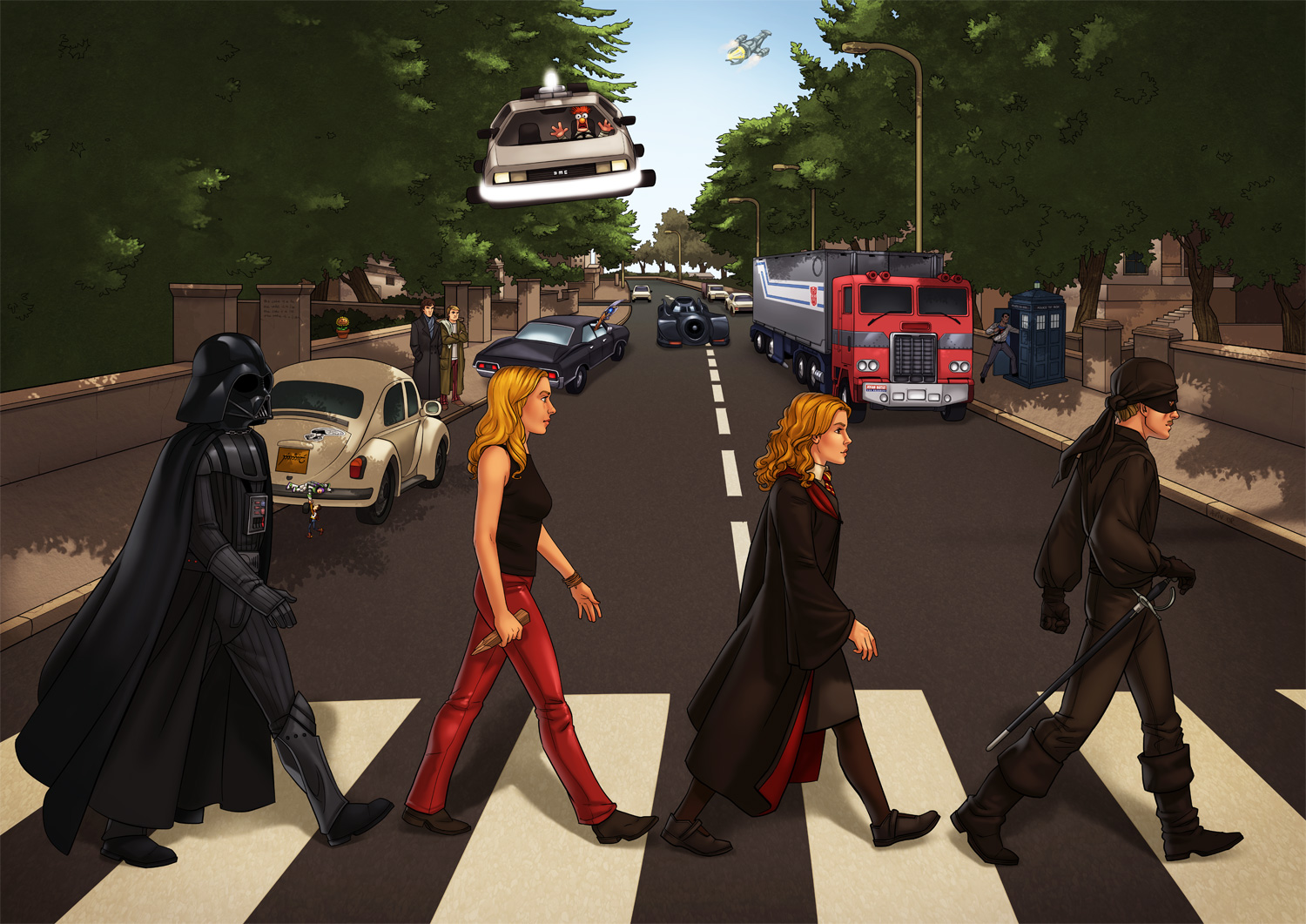
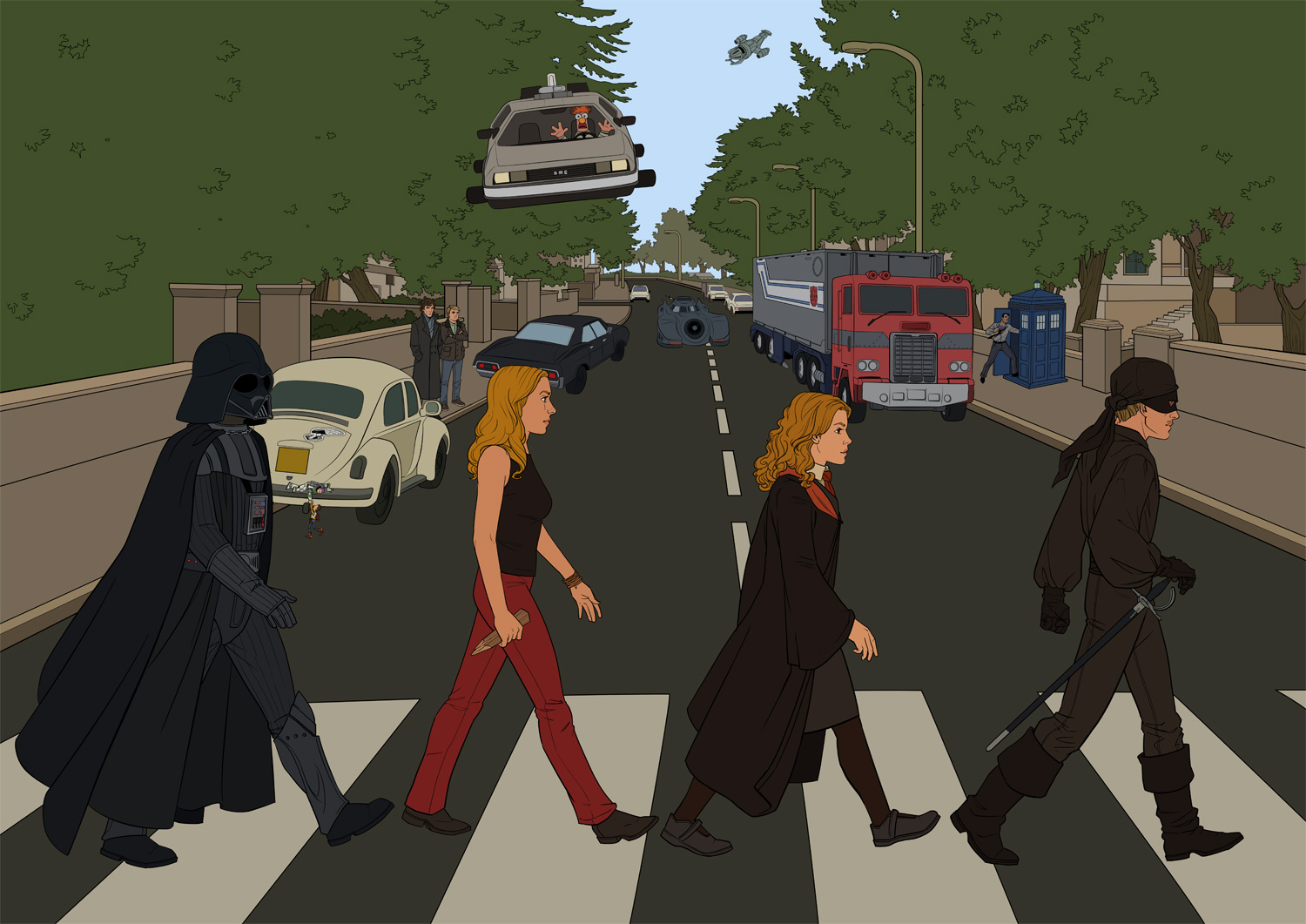
A couple of friends wanted me to illustrate a poster for them, and their request was so detailed and rich with cool geek stuff that I had to take the job or the universe would have imploded around me. So, with Idan and Danielle’s permission, here’s the final piece, and right after it a break-down of the work process:
Clarifications and disclaimers: The original CD cover is the design of Apple Records’ creative director based on a sketch by Paul McCartney (apparently); the idea and choice of all elements are the brainchild of Idan and Danielle; all the characters, vehicles, aircrafts, weapons, puppets and police phone boxes that are actually time machines belong to the owners of their respective intellectual properties. If you post an image from this post somewhere else, I’d appreciate it if you linked back here. Thanks!
Work Process
00 – The request
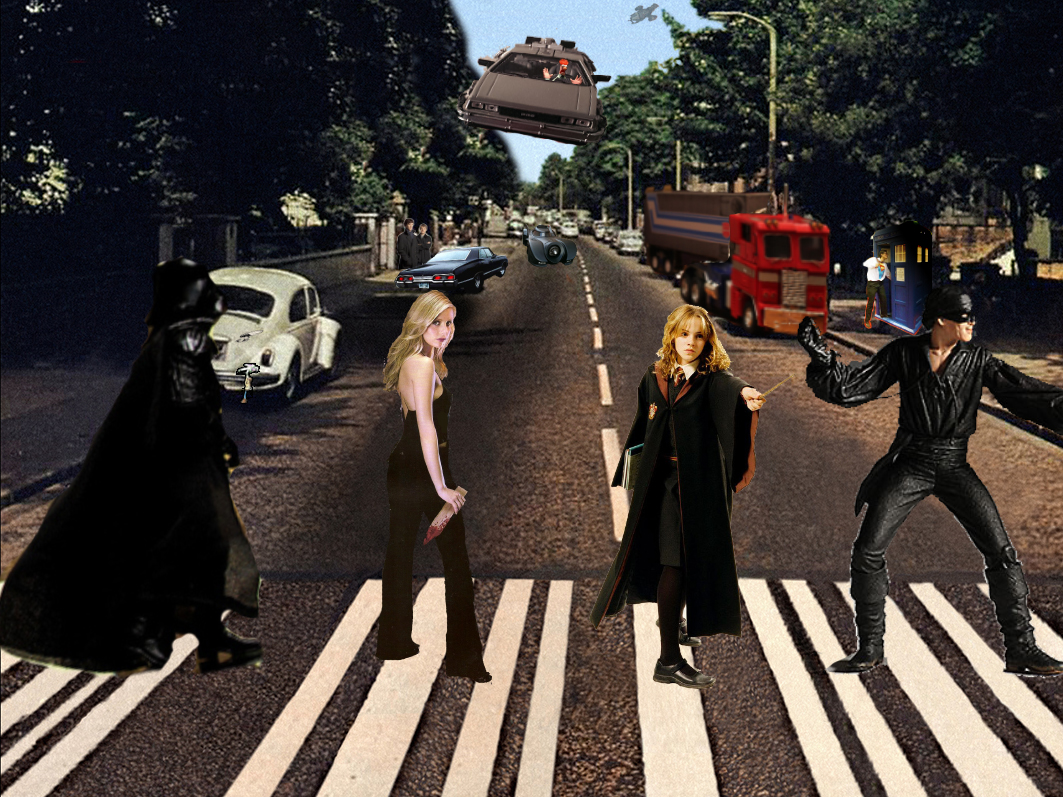
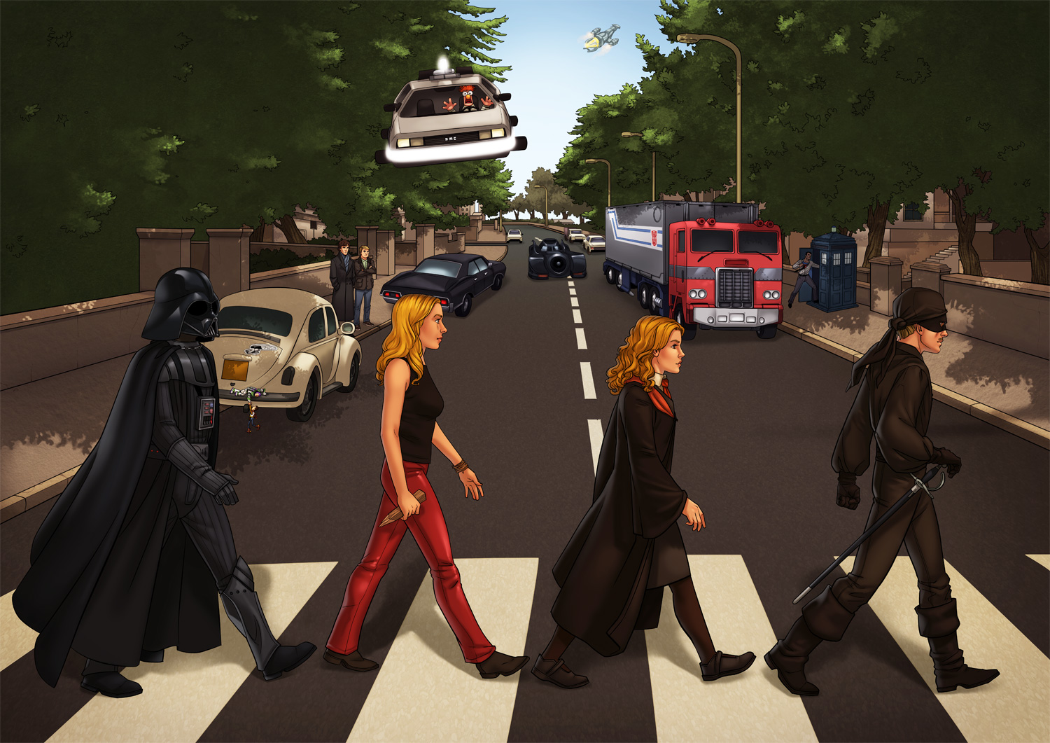
Idan and Danielle’s idea was to illustrate The Beatles’ Abbey Road cover, with the Beatles replaced by characters from their favorite fandoms, and the background filled with elements from TV, movies and video games. I wish every job request I ever got was so meticulous: Idan and Danielle knew exactly what they wanted, thought about all the details in advance and sent me a full list with reference photos they shot themselves and a mockup they put together in Photoshop to convey their ideas. After a few short questions I could get right to work.
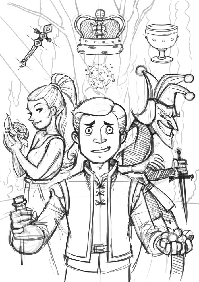
01 – Pencil
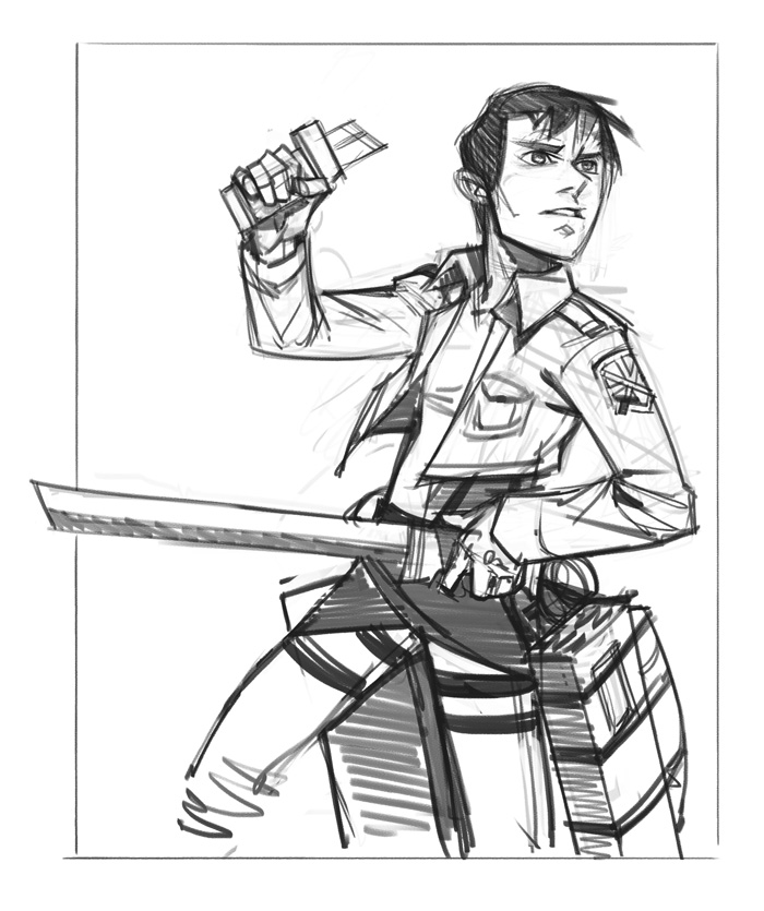
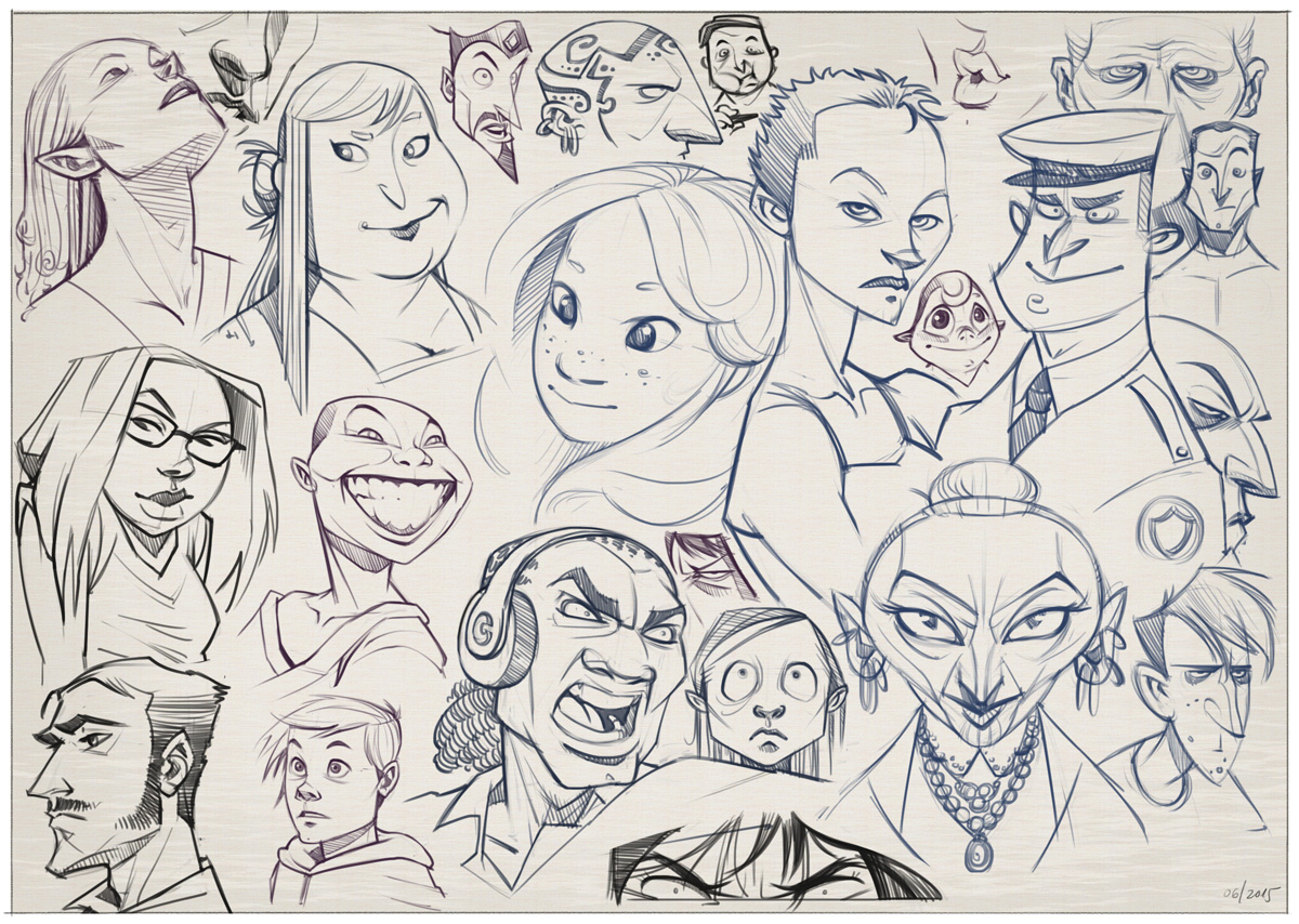
Since the composition was already done, I could skip the initial sketching phase and move on to pencilling all the different elements into one scene. I work directly on the computer, so the “pencil” is a fun brush that comes with more recent versions of Photoshop, that responds not only to Wacom pen pressure but also to its angle.
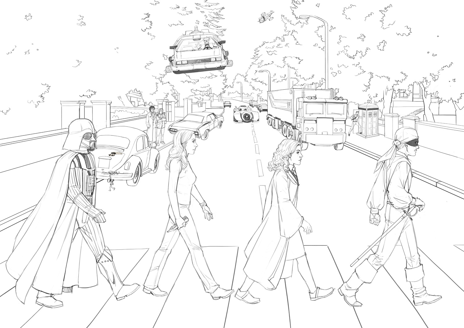
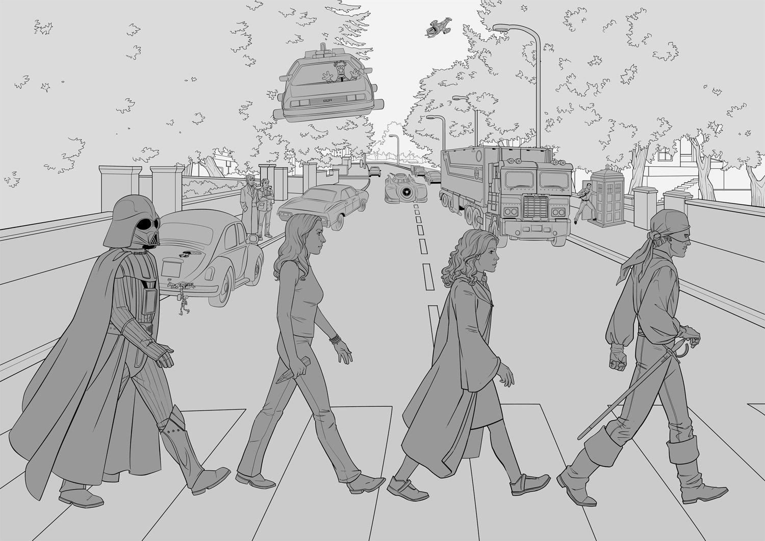
02 – Ink
I wrote a long post about digital inking in Hebrew if you read it (might translate that bad boy one day). In this piece I used mostly Photoshop’s vector tools. Since the poster would be printed big, I wanted to avoid slightly shaky lines that are more likely to happen in freehand inking: they may be negligible on screen, but they won’t be pretty in print. Working with the vector pen tool allowed me to control the curve of each path, and when I was happy with it, the “Stroke Path” feature easily creates a bitmap “ink” line that follows that curve. It was useful mostly for the all technical vehicles and the flowy fabrics; for faces, hands and other small details I inked freehand.
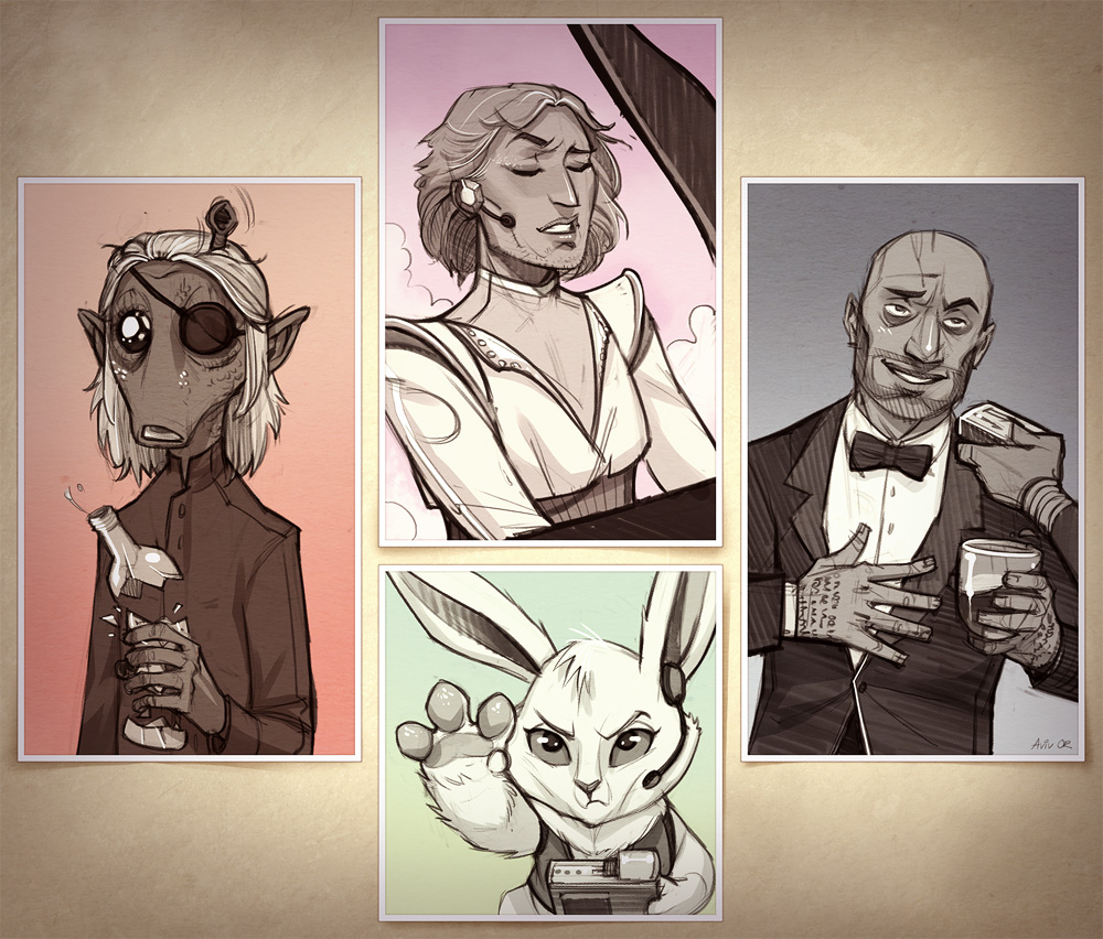
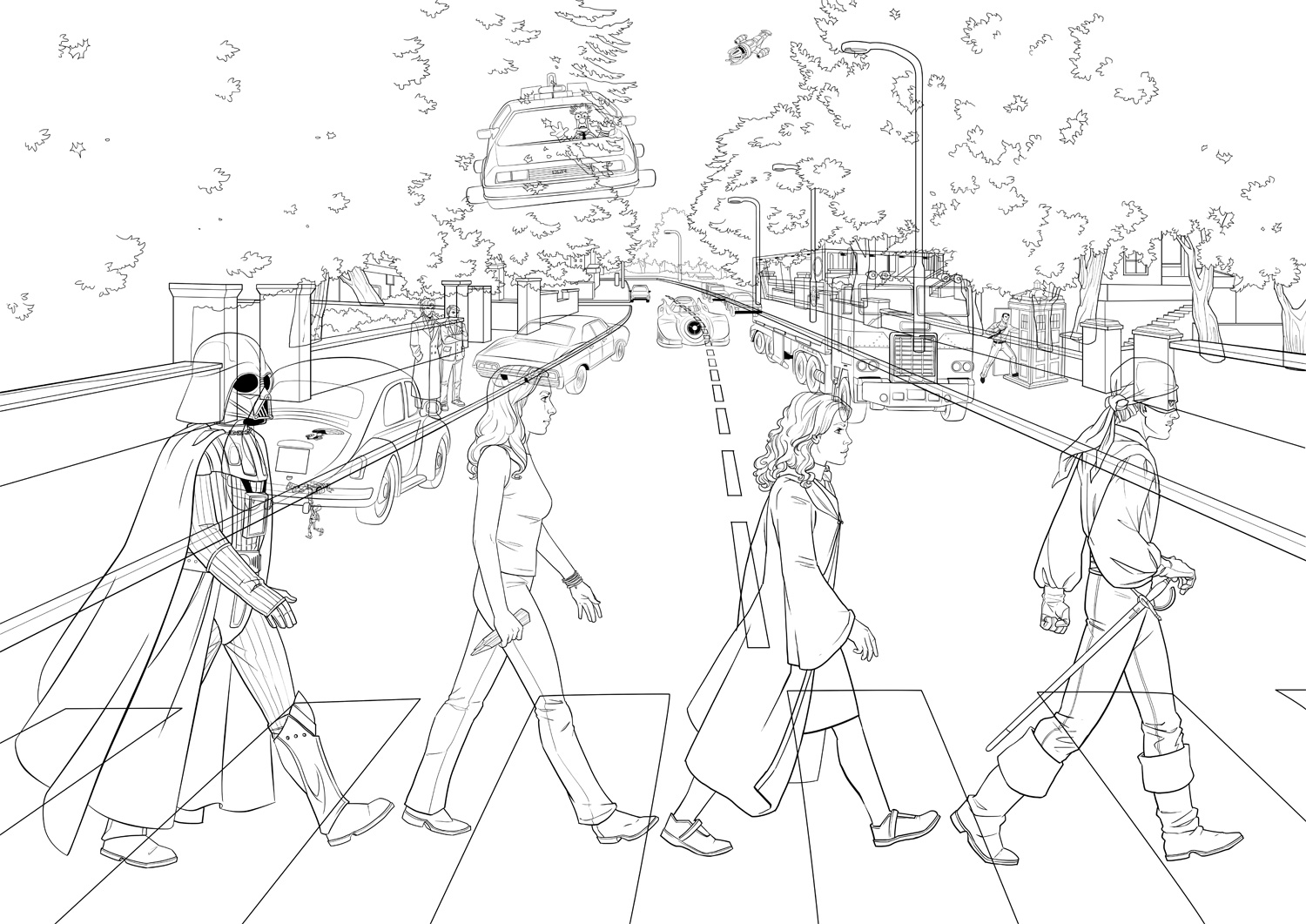
This is how all the inked layers look together:
But to show Idan and Danielle I added basic flat colors so they could tell what was going on. Almost every element in the illustration is on its own layers, so I could easily move and transform things. Oh, Photoshop – my heart is forever yours.
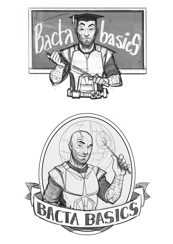
03 – Basic Colors
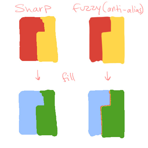
Also called “flatting” – under the lineart layer I block in flat colors as base for adding lighting and shadows.
There’s not much to say about this phase, except that I recommend doing it with tools with sharp pixel edges: use the pencil instead of the brush, and removing the “anti-alias” check from the fill bucket and selection tools. It’s much easier when you want to select or fill already-colored areas, and this shows why:
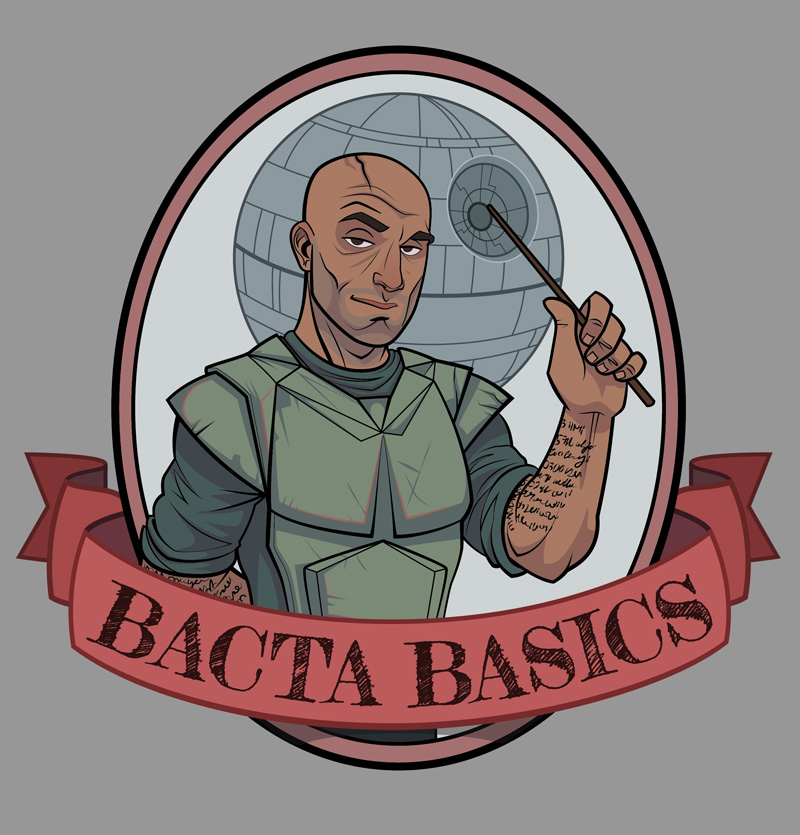
04 – coloring
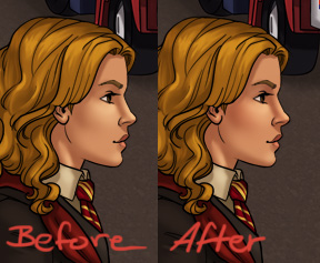
There are dozens of color techniques and dozens of way to achieve each of them in Photoshop. This is just one, that I found pretty efficient: it uses Adjustment Layers to get light and shade quickly, and more important – to change things later if necessary. Adjustment Layers are great because they let you play with a layer’s color and tone in a reversible way, and since they always have a mask attached to them, you can show or hide as much of the adjustment as needed. I separated one character to show the process:

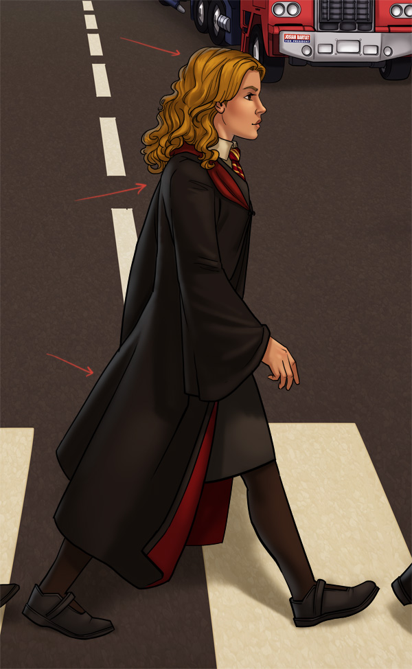
This is more or less the layer structure of every element in the poster (the horrid green is really transparency). #1 is the flat colors layer, the one on the very top is the inking layer, and between them are all the layers that create the shading. The small arrows mean these layers act as clipping masks for the flat colors layer, meaning their content will only be visible within its boundaries (no accidental coloring outside the lines). You create the clipping mask by selecting a layer and pressing ctrl+alt+G.
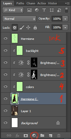
2. The first layer I add is a Brightness/Contrast Adjustment Layer. Click the icon in the red circle and choose Brightness/Contrast. Then make this layer into a clipping mask to it only affects the flat colors layer under it. Adjust your desired brightness and contrast according to the lighting in the scene. Now fill up the mask with black to start with a clear slate, and with a white brush start “painting shadows”. Different brushes will give a different look – softer or harder shadow edges, or a completely different brush shape like in the trees.
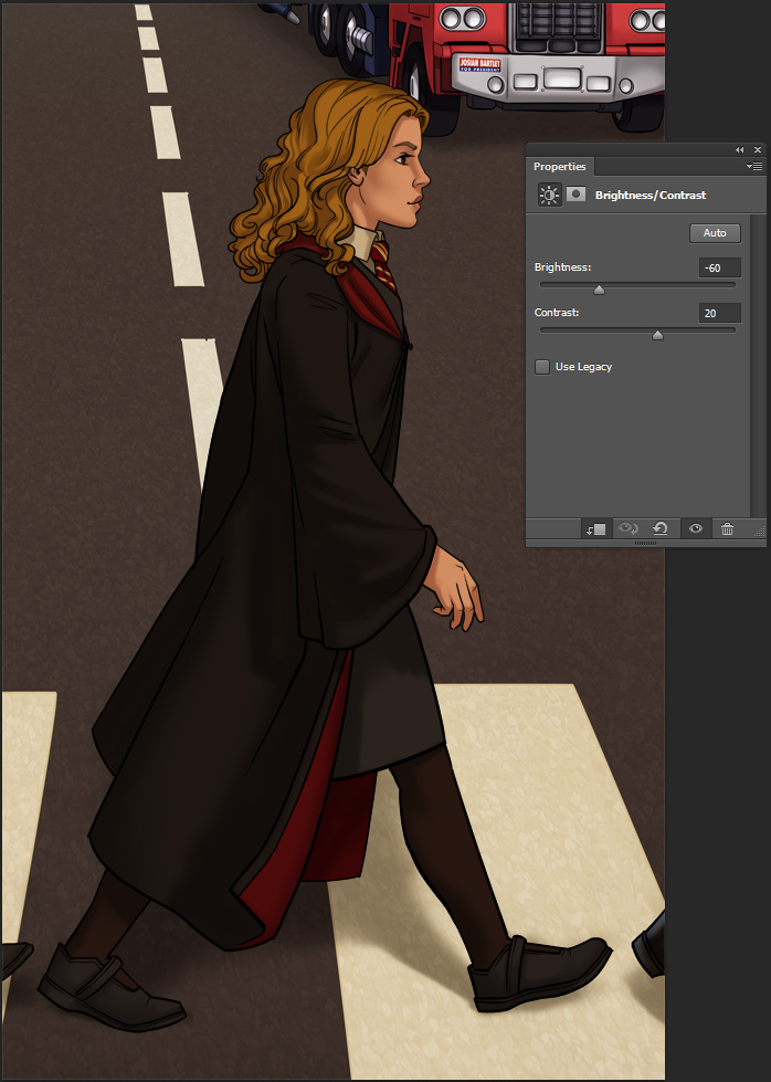
Masks can be confusing at first, but work with them a little and you’ll get the hang of it. You can see the black/white distribution in the mask’s thumbnail: the adjustments are visible in the white areas and invisible in the black.
3. Next layer is similar, except this time I made it brighter and used it for highlights. The process is the same.
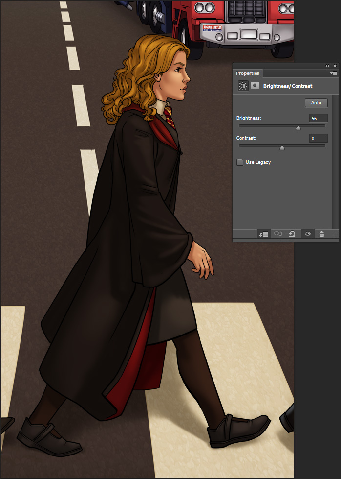
4. This method is quick, but it can make the colors look lifeless, since it’s just one hue getting lighter or darker. After the shading is there, in a new layer I add some more hues where necessary. Hermione here got some reds in her nose, cheeks and hands, with soft touches of color in a layer set to Multiply.
5. Finally, to connect the character to the scene and give her a 3D feel, I add some environmental light in a layer with low opacity. Here the main lighting on the character comes from in front of them, so I added some back light in sky-blue.
You can add more and more Adjustment Layers with different hues for shading, more highlights, reflections etc, but since this illustration has so many details, I felt it was rich enough as it is. As I mentioned, the cool thing with this method is the freedom to change each and every layer without affecting the rest: for example changing Hermione’s robe color with a simple color fill, while the shading above it remains untouched. For your convenience, you can click here to download a PSD of Hermione with all the layers. It’s probably easier to understand when you see it before you.
Here’s the poster after coloring, with a few more Adjustment Layers for separate planes and for the whole scene, to tie it all together (Color Balance is awesome, give it a try).
05 – Fixes
After a test print, we found some color issues (the Batmobile, for instance, was too dark and lost much of its detail). While making corrections we also added a few more small elements that I initially missed (like the writing on the Tardis or the beetle’s headlight) or that Idan and Danielle just came up with (I can list them, but wouldn’t it be fun to spot the differences yourselves?).
Here’s the final again:
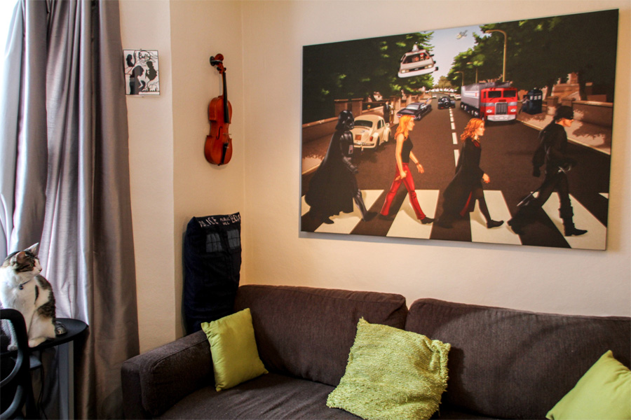
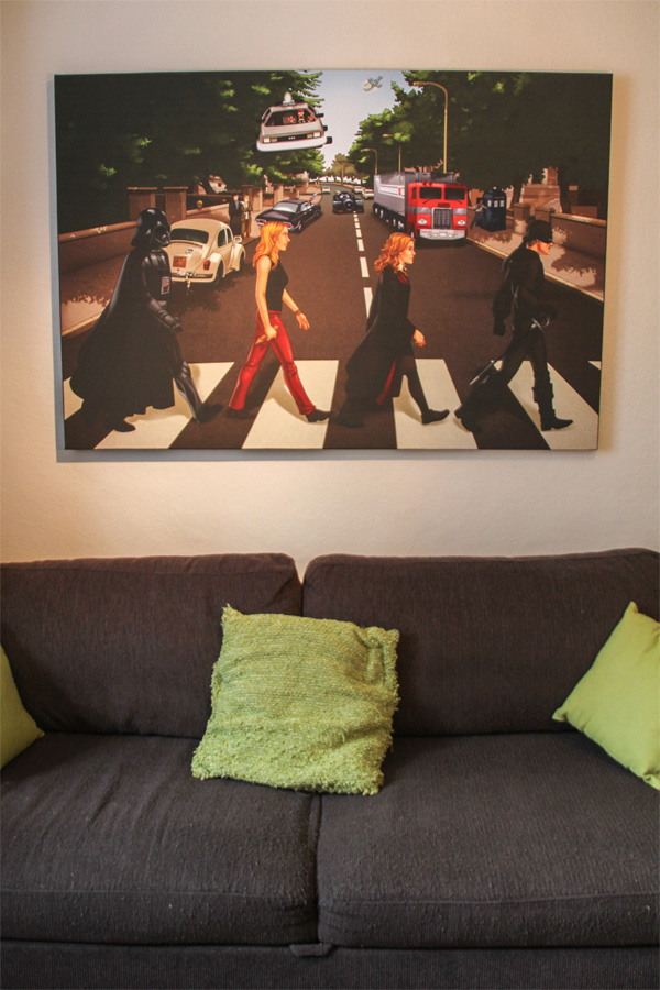
And here it is hung majestically in their cool geeky London apartment:
Got questions about the process? Curious about an element in the poster? Who’ll win in a fight, Buffy or the Man in Black? Leave your comments below!
Aviv
 Hebrew